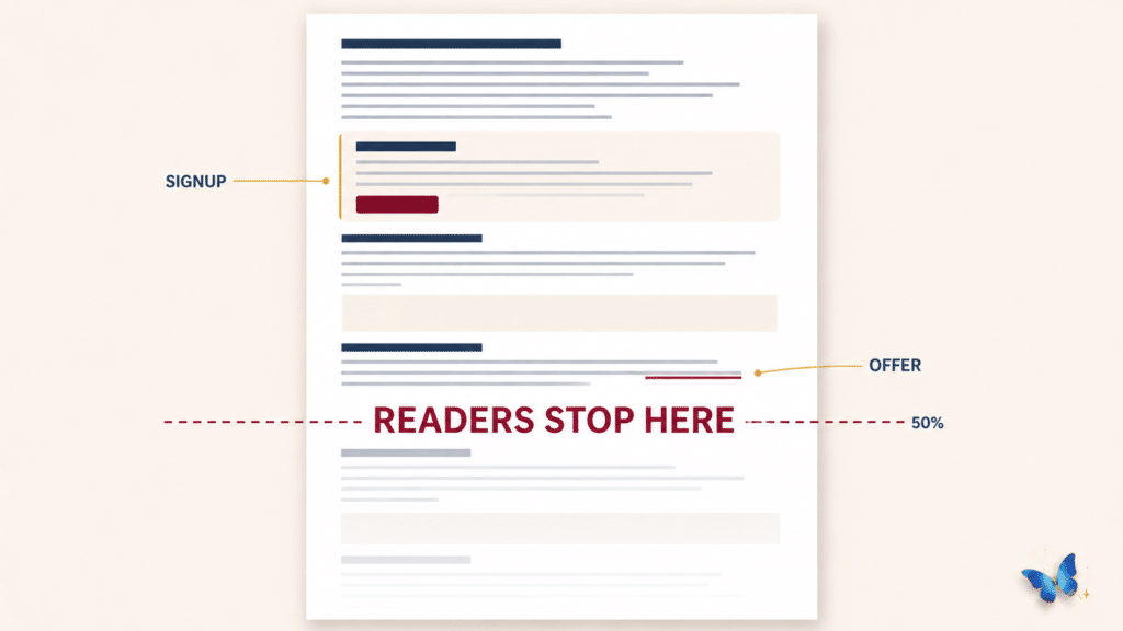
Email signup placement decides whether your form gets seen at all, and most signup boxes sit below the point where the reader stops scrolling. The average person gets about halfway down a page before leaving, so a form parked at the bottom is invisible to most of the people who read the post.
I have spent seventeen years in digital marketing, and the advice I kept reading said to put the signup at the end, because anyone who got that far must have liked the post.
That advice is still on every page you will find about this. It rests on the idea that readers finish, and they do not.
What is the best email signup placement in a blog post?
Email signup placement comes down to one moment. Put the form directly after the first section that gives the reader something she can use.
Not at the top before you have earned anything, and not at the bottom where most people never arrive.
The moment she finishes a section and thinks that was worth reading is the moment she is most willing to take a step. That feeling does not last long, and it will not survive another eight hundred words of yours.
Every generic guide on this subject tells you to place one at the top, one in the middle and one at the end, then tells you to test it. That is not a rule, that is somebody avoiding the question.
How far down a blog post do readers get?
About halfway, and less than that on a phone. Contentsquare measured ninety nine billion sessions and found average scroll depth sitting at 50.5% on desktop and 45.2% on mobile, with both numbers falling every year.
Chartbeat looked at two billion page visits and found more than half of all pageviews got under fifteen seconds of attention. On a post over two thousand words, only twenty to thirty percent of readers reach the end.
Look at what that means for your own page. If your offer lives in the last quarter of the post, you built it for the smallest group of people who visit.
Why does email signup placement at the bottom of a post fail?
Because almost nobody is down there to see it. Bottom of page email signup placement fails on attendance, not on your wording or your button color, and no amount of rewriting fixes a form nobody scrolled to.
There is a second reason underneath the first. By the time a reader reaches the end she has already decided what she came for, and she is closing the tab with the answer she wanted.
The offer needed to reach her while the problem was still live. At the bottom of the page the problem is solved and the moment is gone.
Want help finding your story?
An offer only works when the reader sees her own problem in it. The Three-Day Mirror walks you through finding that language in your own story, in your own words.
Help me find my storyThat box you scrolled past a moment ago is sitting there for the reason I am describing. It came after the first section that handed you something, not at the end where I would have felt more comfortable putting it.
You can judge for yourself whether it interrupted you. That is the whole argument, tested on the page you are reading rather than promised.
How many signup forms should one blog post have?
One, in almost every case. A second form does not double your chances, it splits her attention and makes both of them feel like advertising.
The exception is a post long enough that a reader at the top and a reader near the end are two different people, and even then the second one should be the same offer rather than a new one. Email signup placement is a question of finding the single right moment, not of covering the page.
Two different offers on one page is the mistake I see most often. She now has a decision to make about you instead of a decision to make about her problem, and the easiest way to settle it is to leave.
Picking that single offer is its own piece of work, and the Content Map walks through it for thirty seven dollars.
Does email signup placement change on mobile?
It matters more, because the numbers are worse and most of your readers are there. Mobile scroll depth runs about five points below desktop, and a paragraph that looks compact on a laptop can run three screens deep on a phone.
The practical effect is that email signup placement measured in scroll percentage lies to you. What matters is how many thumb swipes it takes to reach the box, and you can only learn that by opening your own post on your own phone.
Do that once and you will find offers you thought were mid-post sitting far below where anyone is still reading.
How do you know if anyone is seeing your signup form?
Check where your analytics is measuring from, because the default setting hides the answer. Google Analytics fires its scroll event at ninety percent of the page by default, which means the only scroll data you have describes the readers who nearly finished.
Everyone who left at forty percent, which is most of them, is missing from that number entirely. Your report looks healthy because it is only counting the people who stayed.
This is the part almost nobody teaches, and it is why so many women conclude their writing is the problem. The writing was usually fine and the measurement was set to flatter it.
You do not have to fix the setting to act on this. Assume your real scroll depth is worse than the number you are looking at, and place the offer higher than that number would suggest.
If you want the accurate version later, scroll tracking at twenty five, fifty and seventy five percent has to be set up deliberately rather than left on the default. That is a one time job and it is not urgent, because the placement decision does not wait for better data.
What you can see today without changing anything is which posts hold people and which lose them early. Those two groups need the offer in different places.
Where should the offer go in a long post?
Higher than instinct tells you. On a two thousand word post the real halfway point for your reader sits nearer the thirty five percent mark, because attention drains faster than the word count suggests.
Good email signup placement follows her attention rather than the page layout. Find the first section that resolves something for her and put the form immediately underneath it.
If it feels early to you, that feeling is usually a sign you have it in the right spot.
The instinct to wait is about your comfort, not about how she reads. I know that because I ran my own offers at the bottom for years and told myself it was manners.
Should the offer come before or after you deliver the value?
After, and immediately after. An offer that arrives before you have given her anything is a stranger asking for something, and a stranger has no reason to say yes to you yet.
An offer that arrives immediately after a real payoff is a natural next step, because she has only now experienced what you are like to learn from. She is not taking a risk, she is carrying on with something she already started.
Give first, ask second, and ask while the giving is still fresh rather than nine hundred words later.
The page you are on right now
Scroll back up and look at where the box landed relative to everything you have read. It came after the section on scroll depth, which was the first place this post gave you a number you could use.
That was deliberate email signup placement, and it is the same decision I am asking you to make on your own post this week. Not a rule I read somewhere, a position I picked because of what the scroll data says about where people stop.
Placement only pays off when the thing inside the box is worth having. If nobody signs up from a form you have already moved, the problem has stopped being position and started being whether the opt-in is worth signing up for.
Do This
Open your best performing post on your phone, not your laptop, and scroll to your offer while counting the swipes it takes to get there. Four or more and most of your readers are gone before they reach it.
Then find the first section in that post that hands her something she can use, and move the offer to sit directly underneath it. One post, ten minutes, and you will see the new position before you publish anything.
Be unpolished, Angela